If there are multiple SPFx components loaded on the page which depend on OUIFR components, the size of each bundle will be affected, as by default the OUIFR components are included in each SPFx bundle.
One way to mitigate this issue is to include all your custom components (which depend on OUIFR) into an SPFx library component and then consume the library component from SPFx webparts and extensions. This will make sure that if you have reusable custom components, they won't be loaded multiple times on the page if multiple SPFx webparts (or extensions) are consuming them.
Let's see how to achieve this. We will be working with SPFx 1.9.1 which contains the GA version of Library Components:
Let's see how to achieve this. We will be working with SPFx 1.9.1 which contains the GA version of Library Components:
1) Create SPFx Library and Consumer component structure
First, make sure you have an SPFx library project as well as a "consumer" SPFx project containing webparts (or extensions). Instructions on how to create this are in the Microsoft docs: https://docs.microsoft.com/en-us/sharepoint/dev/spfx/library-component-tutorial
The code for this post is also available on GitHub if you want to have a look: https://github.com/vman/spfx-lib-components-ouifr
2) Create a new custom react component which internally uses Office UI Fabric React
In the library component project, create a new react component in a new file e.g. ButtonComponent.tsx

Here are the contents of the custom react component:
3) Update the index.ts file
In the index.ts file of the library component, include the new component to be exported:
This file contains bidirectional Unicode text that may be interpreted or compiled differently than what appears below. To review, open the file in an editor that reveals hidden Unicode characters.
Learn more about bidirectional Unicode characters
| export { CustomOfficeUiFabricLibrary } from './libraries/customOfficeUiFabric/CustomOfficeUiFabricLibrary'; | |
| export { ButtonComponent } from './libraries/customOfficeUiFabric/ButtonComponent'; |
4) Update config.json
Next, in the config/config.json file of the library component, make sure that the entry point is pointing to /lib/index.js
This file contains bidirectional Unicode text that may be interpreted or compiled differently than what appears below. To review, open the file in an editor that reveals hidden Unicode characters.
Learn more about bidirectional Unicode characters
| { | |
| "$schema": "https://developer.microsoft.com/json-schemas/spfx-build/config.2.0.schema.json", | |
| "version": "2.0", | |
| "bundles": { | |
| "custom-office-ui-fabric-library": { | |
| "components": [ | |
| { | |
| "entrypoint": "./lib/index.js", | |
| "manifest": "./src/libraries/customOfficeUiFabric/CustomOfficeUiFabricLibrary.manifest.json" | |
| } | |
| ] | |
| } | |
| }, | |
| "externals": {}, | |
| "localizedResources": { | |
| "CustomOfficeUiFabricLibraryStrings": "lib/libraries/customOfficeUiFabric/loc/{locale}.js" | |
| } | |
| } |
This step was not necessary in SPFx 1.8.2-plusbeta but seems there is a bug in SPFx 1.9.1. I have created a GitHub issue here:
5) Update the consumer web part
Make sure that the library component is referenced in the consumer webpart e.g. through npm link or by using a monorepo manager like rush or lerna.
More details on using npm link in this in the Microsoft docs: https://docs.microsoft.com/en-us/sharepoint/dev/spfx/library-component-tutorial
And finally, in your consumer SPFx react webpart, you can reference the custom component:
This file contains bidirectional Unicode text that may be interpreted or compiled differently than what appears below. To review, open the file in an editor that reveals hidden Unicode characters.
Learn more about bidirectional Unicode characters
| import * as React from 'react'; | |
| import { IHelloWorldProps } from './IHelloWorldProps'; | |
| import { CustomOfficeUiFabricLibrary, ButtonComponent } from 'spfx-lib-ouifr'; | |
| export default class HelloWorld extends React.Component<IHelloWorldProps, {}> { | |
| private myInstance; | |
| constructor(props){ | |
| super(props); | |
| this.myInstance = new CustomOfficeUiFabricLibrary(); | |
| } | |
| public render(): React.ReactElement<IHelloWorldProps> { | |
| return ( | |
| <div> | |
| <ButtonComponent | |
| primaryButtonText="Primary Button" | |
| defaultButtonText= "Default Button" /> | |
| </div> | |
| ); | |
| } | |
| public componentDidMount(){ | |
| console.log(this.myInstance.name()); | |
| } | |
| } |
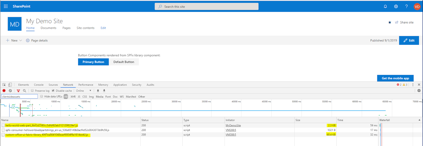
When you deploy both the SPFx packages in the app catalog and then add them on a page, you will see different bits of code being loaded separately: